Sobre
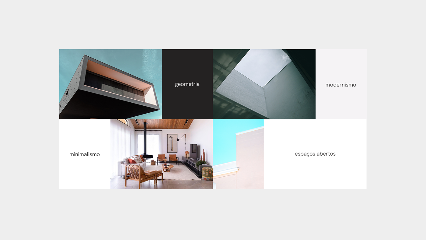
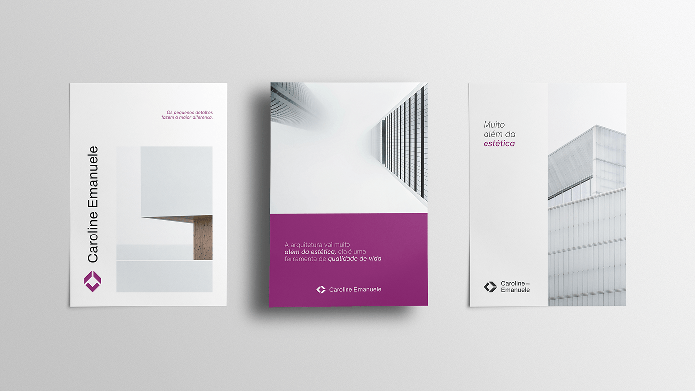
Caroline Emanuele é uma arquiteta brasileira que leva em seus projetos um estilo contemporâneo e minimalista. O trabalho da arquiteta é caracterizado pelo uso de linhas retas e paralelas, espaços amplos e o uso de materiais que valorizam os ambientes em todos os seus aspectos físicos e visuais. Segundo ela, a arquitetura "vai muito além da estética, é uma ferramenta de qualidade de vida". Com muita experiência e uma variedade enorme de projetos executados, Caroline nos contatou para desenvolver sua marca pessoal e fazer parte de um novo capítulo de sua trajetória profissional, expressando em sua identidade visual a elegância, o minimalismo e o profissionalismo que estão em seu DNA.
About
Caroline Emanuele is a Brazilian architect who brings a contemporary, minimalist style to her projects. Her work is characterized by the use of straight and parallel lines, wide spaces and the use of materials that enhance the ambients in all their physical and visual aspects. According to her, architecture "goes far beyond aesthetics, it is a tool for quality of life". With a lot of experience and a huge variety of completed projects, Caroline contacted us to develop her personal brand and be part of a new chapter in her professional career, expressing in her visual identity the elegance and minimalism extracted right from the core of the brand's DNA.
Símbolo
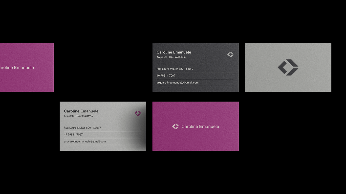
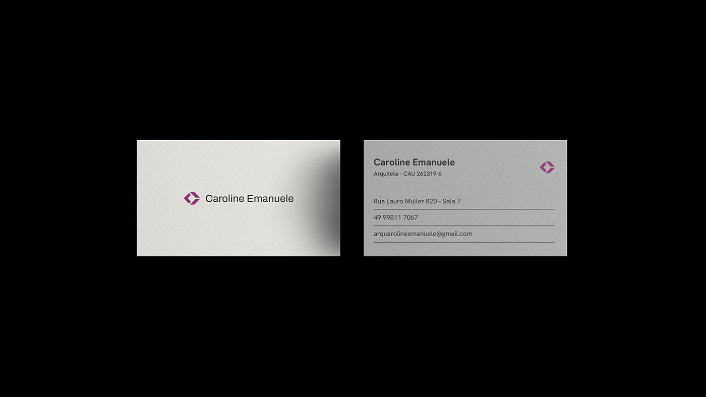
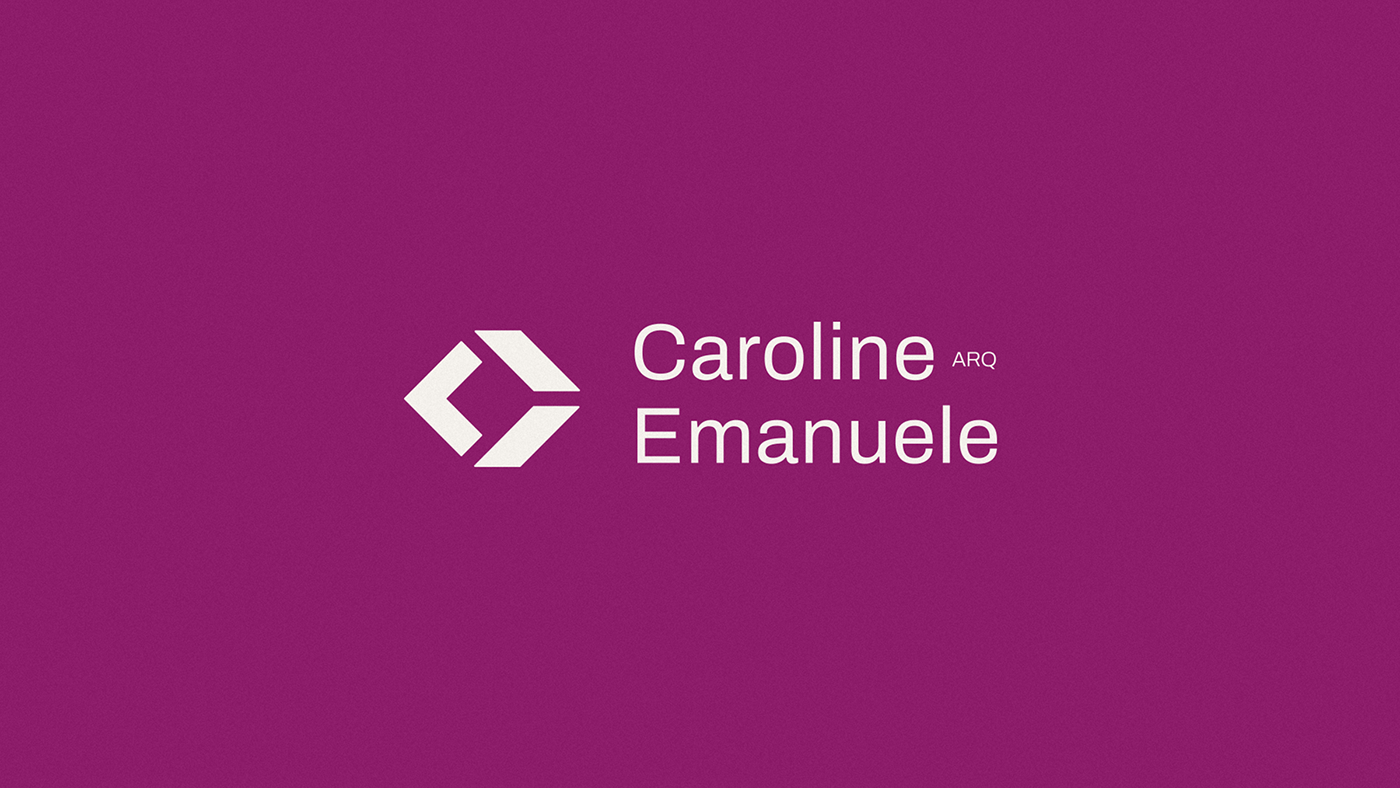
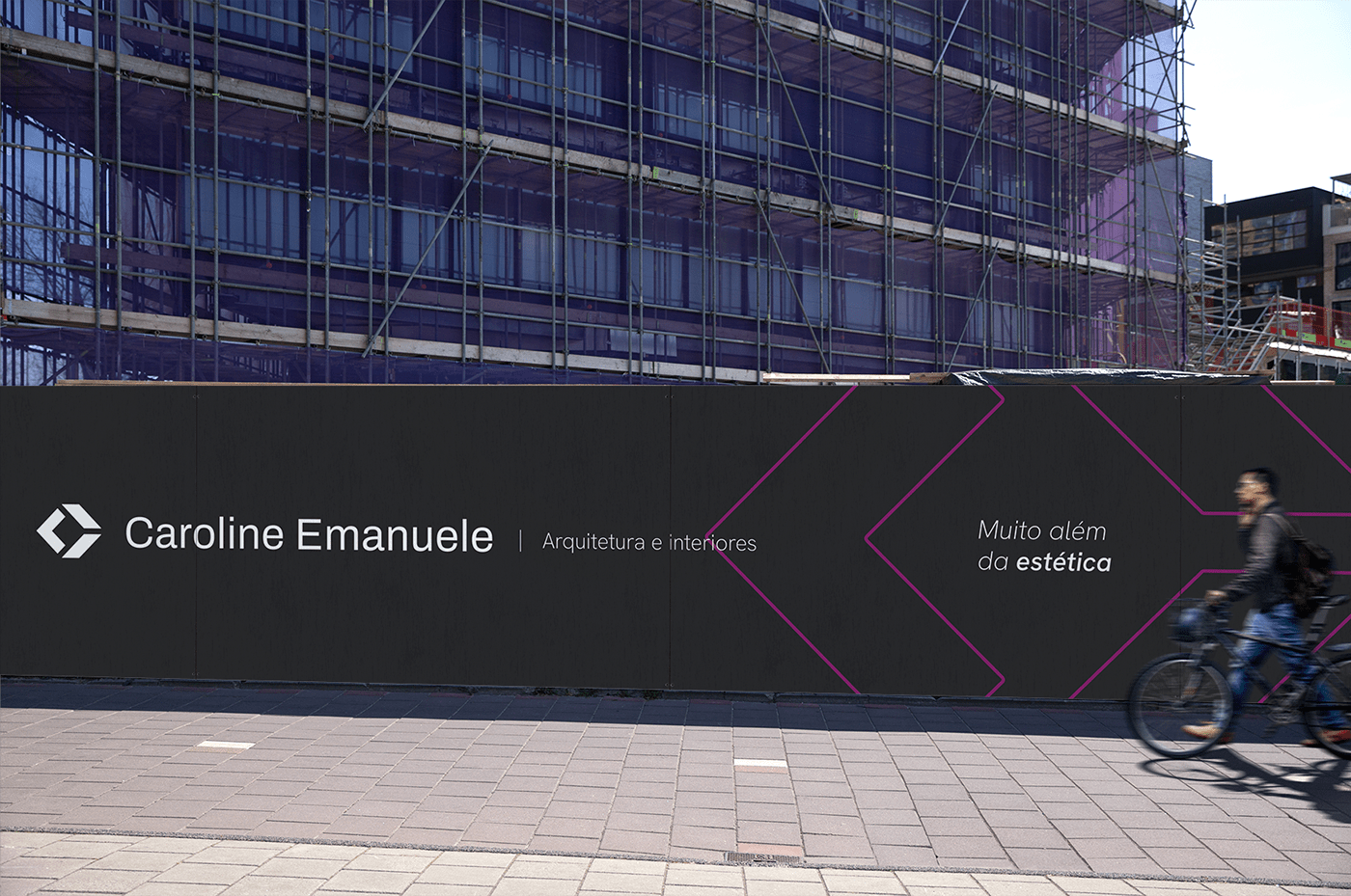
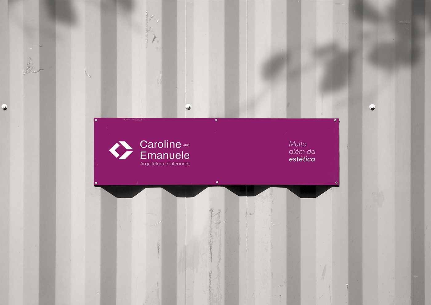
Para representar a marca em sua forma mínima, desenvolvemos um símbolo que sintetiza o estilo arquitetônico de Caroline. Utilizamos linhas retas e formas retangulares, unindo-as com a inicial do nome da arquiteta para criar a representação planificada de um cubo em perspectiva, figura tridimensional que aqui representa o estilo da arquitetura contemporânea. O símbolo possui ainda um espaço vazio no centro, remetendo aos grandes vãos e espaços abertos característicos de seus projetos.
Symbol
To represent the brand in its minimal form, we developed a symbol that synthesizes Caroline's architectural style. We used straight lines and rectangular shapes, joining them with the initial of the architect's name to create the planified representation of a cube in perspective, a three-dimensional figure that here represents the style of contemporary architecture. The symbol also has an empty space in the center, referring to the large spans and open spaces that characterize her projects.


Identidade Visual
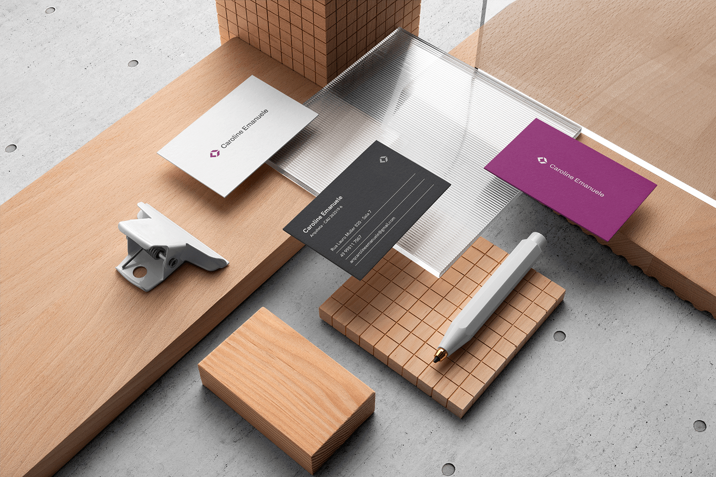
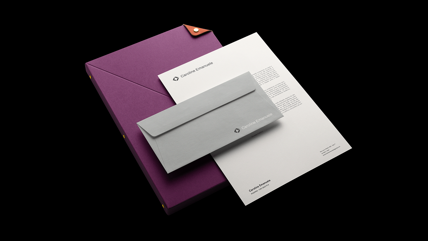
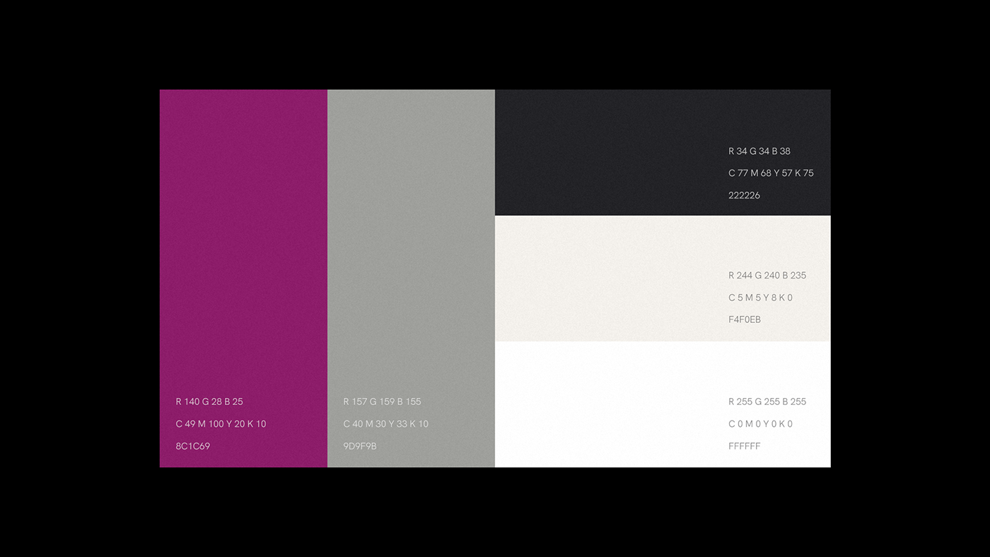
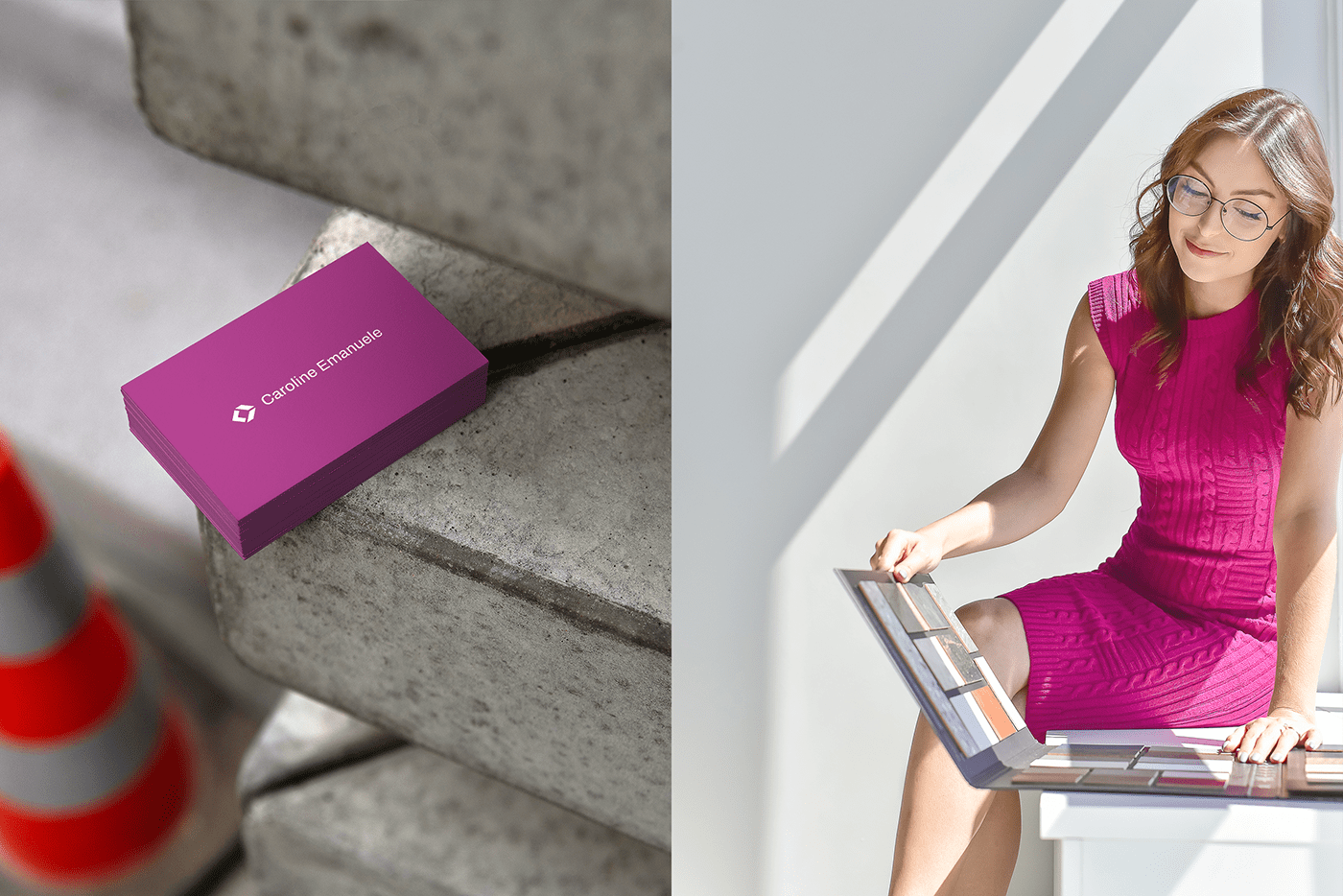
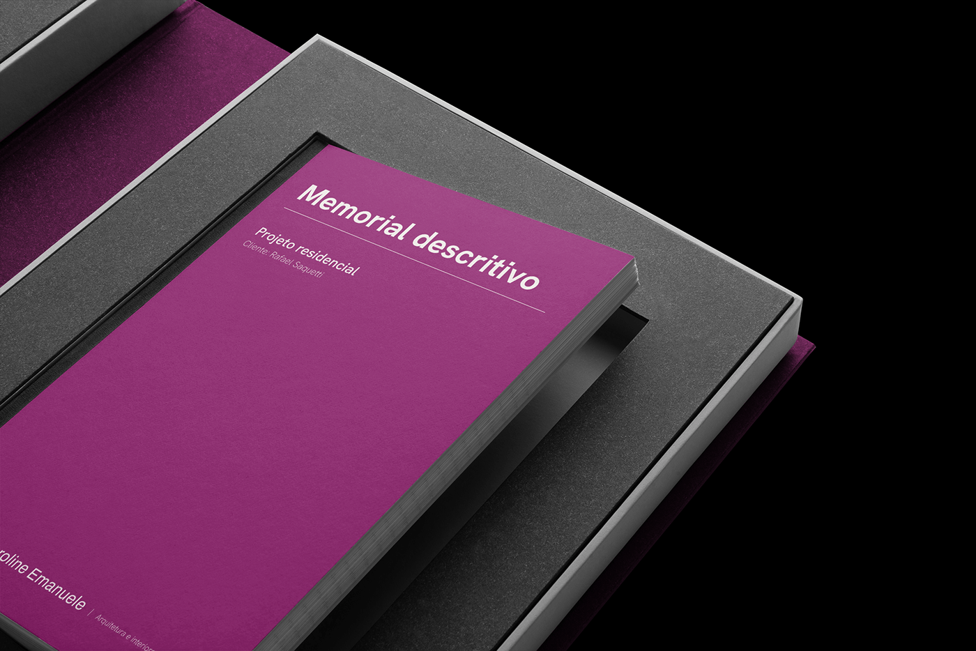
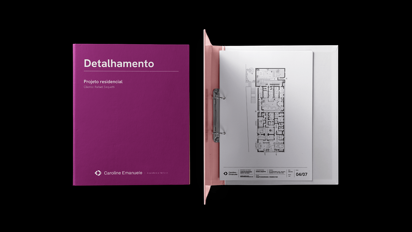
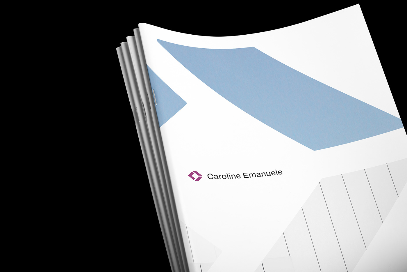
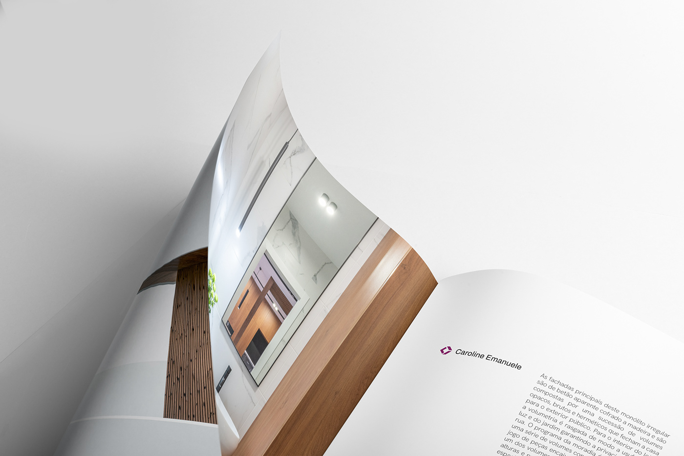
As cores utilizadas na identidade visual são oriundas da paleta "inverno frio", a qual Caroline utiliza como cores pessoais, alinhando sua imagem física à imagem da marca. A tipografia institucional foi desenvolvida pela Hanken Design Co. e tem a função de equilibrar o peso geométrico do símbolo. A Hanken Grotesk possui formas fluidas e poucos cortes com ângulos retos, dando um respiro para as aplicações com símbolo e com imagens de projetos. As aplicações seguem um padrão minimalista e limpo, tal qual os projetos criados pela arquiteta. Foram desenvolvidos materiais de identificação pessoal, editoriais, técnicos e de comunicação visual para obras.
Visual Identity
The colors used in the visual identity come from the "cold winter" palette, which Caroline uses as her personal colors, aligning her physical image to the brand's image. The institutional typography was developed by Hanken Design Co. and has the purpose of balancing the type with the geometric weight of the symbol. The Hanken Grotesk has fluid shapes and few cuts with right angles, softening the applications with symbol and project images. The applications are clean an minimalistic, just like the projects created by Caroline. We developed materials for personal identification, editorial, technical and visual communication for construction sites.


Client
Caroline Emanuele
Caroline Emanuele
Brand Identity and Design
Rafael Saquetti
Rafael Saquetti
Photography
Poli Bertolin
Poli Bertolin